Reviews
Glean Review - The Enterprise AI Platform Built On Your Own Data
Glean has no trial and no self-serve signup, so we dug into what's public instead: connector specs, the agent library, and a rate card almost no enterprise vendor publishes.
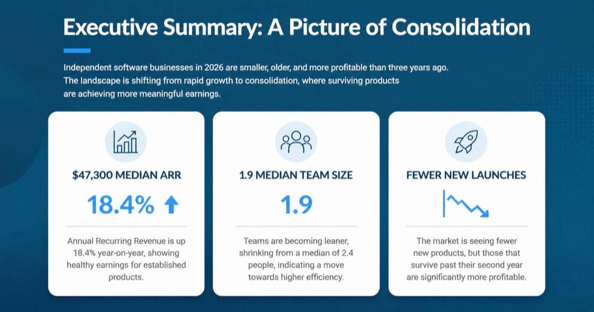
We've tested SlidesPilot, an AI presentation agent that turns PDFs, Word files, URLs and pasted text into PowerPoint decks that stay grounded in the source document.
Welcome to this SlidesPilot review ✨
Almost every AI deck generator I've tried fails in one of two ways. Either it takes your document and writes a confident, fluent presentation that quietly invents half the numbers, or it produces something beautiful that turns out to be a stack of pictures the moment you open it in PowerPoint. The first wastes your afternoon fact-checking. The second wastes it retyping.
SlidesPilot positions itself directly against both problems. It calls itself a source-to-presentation agent: you feed it a PDF, a Word file, a URL or a block of pasted text, and it builds a deck that stays anchored to what the source actually said, then hands you a real editable PPTX at the end.
That is a testable claim, so I tested it. I wrote a six-page research report from scratch with tables and figures I knew by heart, fed it in twice under different settings, fed in a separate Word document with a different set of numbers, then pulled the results apart in three different PowerPoint exports to see what was really inside them.
The workspace is refreshingly boring, in the good sense. A left rail (Home, Presentations, AI Images, View Plans, Themes), and a grid of entry points on the home screen: New presentation, AI infographic, New blank, plus a row of narrower tools like PDF to PPT, Word to PPT, Youtube to PPT, Wikipedia to PPT, Webpage to PPT, Enhance PPT, Beautify PPT and Make PPT Editable. There's a "From PPT" row too, for going the other way into PDF, Word, JPG, PNG or plain text.
"New presentation" is the one that matters. It opens a two-panel screen: your source on the left, and every generation setting on the right. Four tabs cover the inputs: PDF, Word to PPT, YouTube & Web to PPT, Paste in text, and Generate PPT (a topic prompt, no source needed). Uploads cap at 50 MB and accept PDF, Word or PPT.
The settings panel is where the product shows its hand. Design mode is a two-way switch between Standard and Beautified. Length offers Auto, Short (1 to 10 slides), Long (11 to 20 slides) or Custom (up to 200). Density runs Auto, Minimal, Concise, Detailed. Tone runs Auto, Neutral, Formal, Friendly, Persuasive, Educational, Academic. And there's an Instructions box with a prompt library behind it.
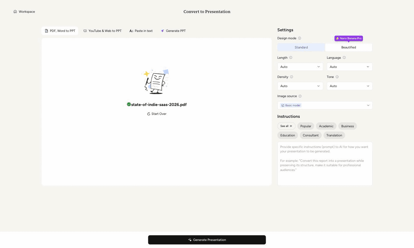
That prompt library is better than it needs to be. It holds 49 saved instructions across six categories, and they're not filler: alongside the obvious "Summarize" and "Preserve" there are proper frameworks like IMRaD for empirical papers, PICO for clinical studies, CASP for critical appraisal, Porter's Five Forces for industry analysis, and the McKinsey 7-S model. Whoever wrote these has sat through the meetings.
This is the whole pitch, so I made it hard to fake. My test document was a six-page survey report full of specific, awkward numbers: a median ARR of $47,300, a median team size falling from 2.4 to 1.9, four cohort rows with distinct ARR and profitability figures, a five-channel marketing table with adoption rates, effectiveness rates and cost per signup, and a fieldwork window of 6 January to 14 February 2026.
The first run, on Beautified with Length set to Long, produced 17 slides. The structure mapped almost section for section onto the source, and it opened with the report's own subtitle and publisher.
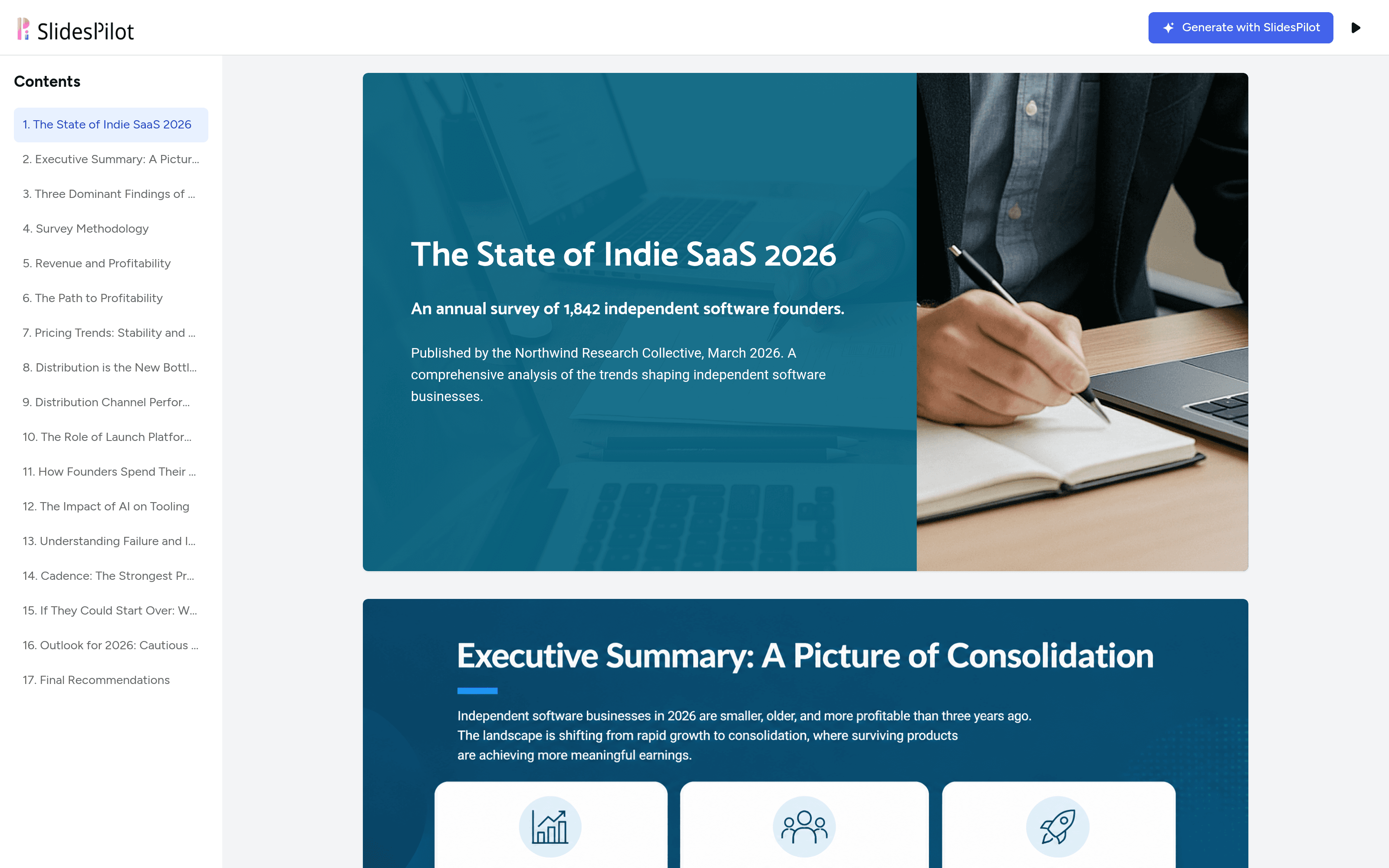
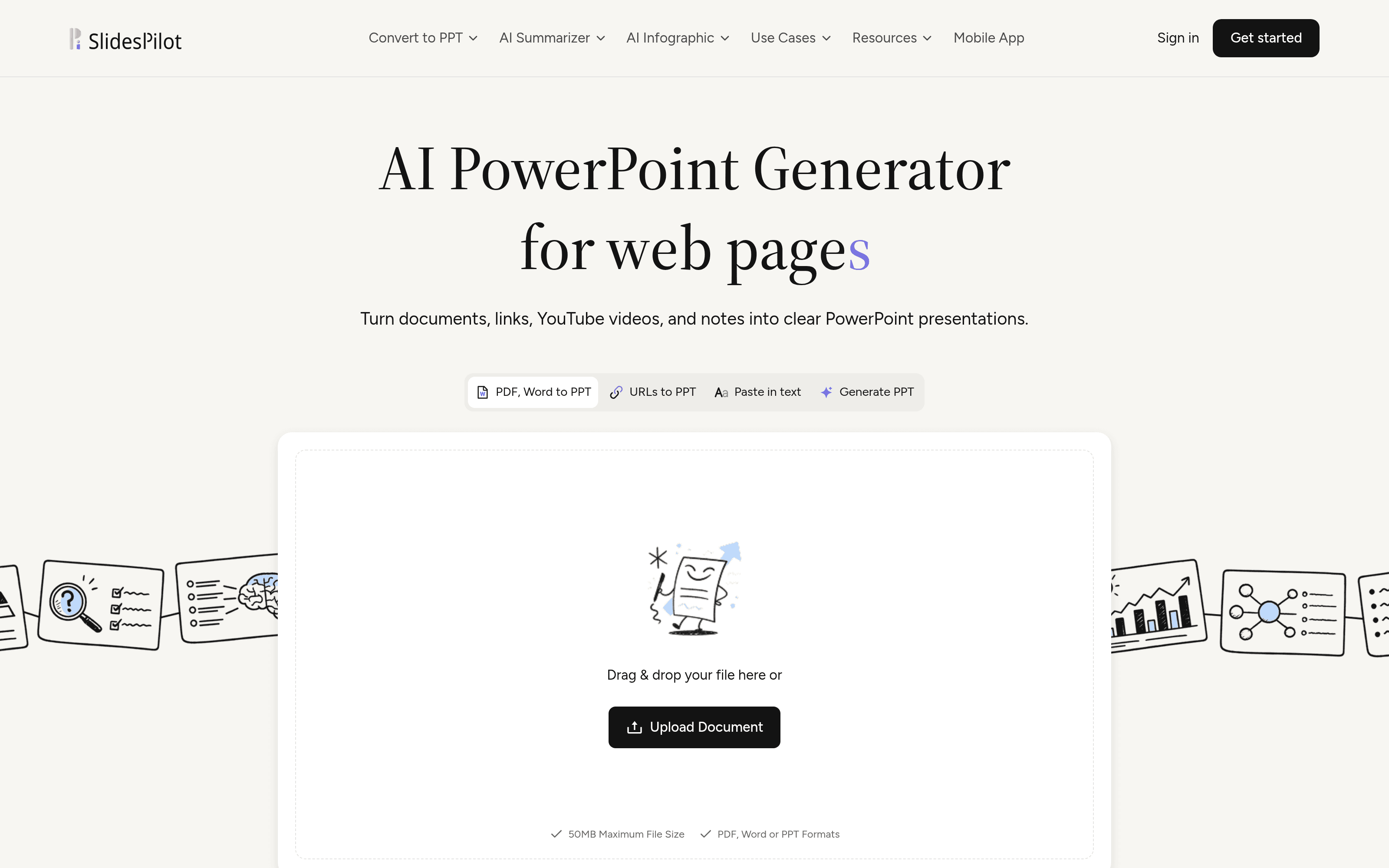
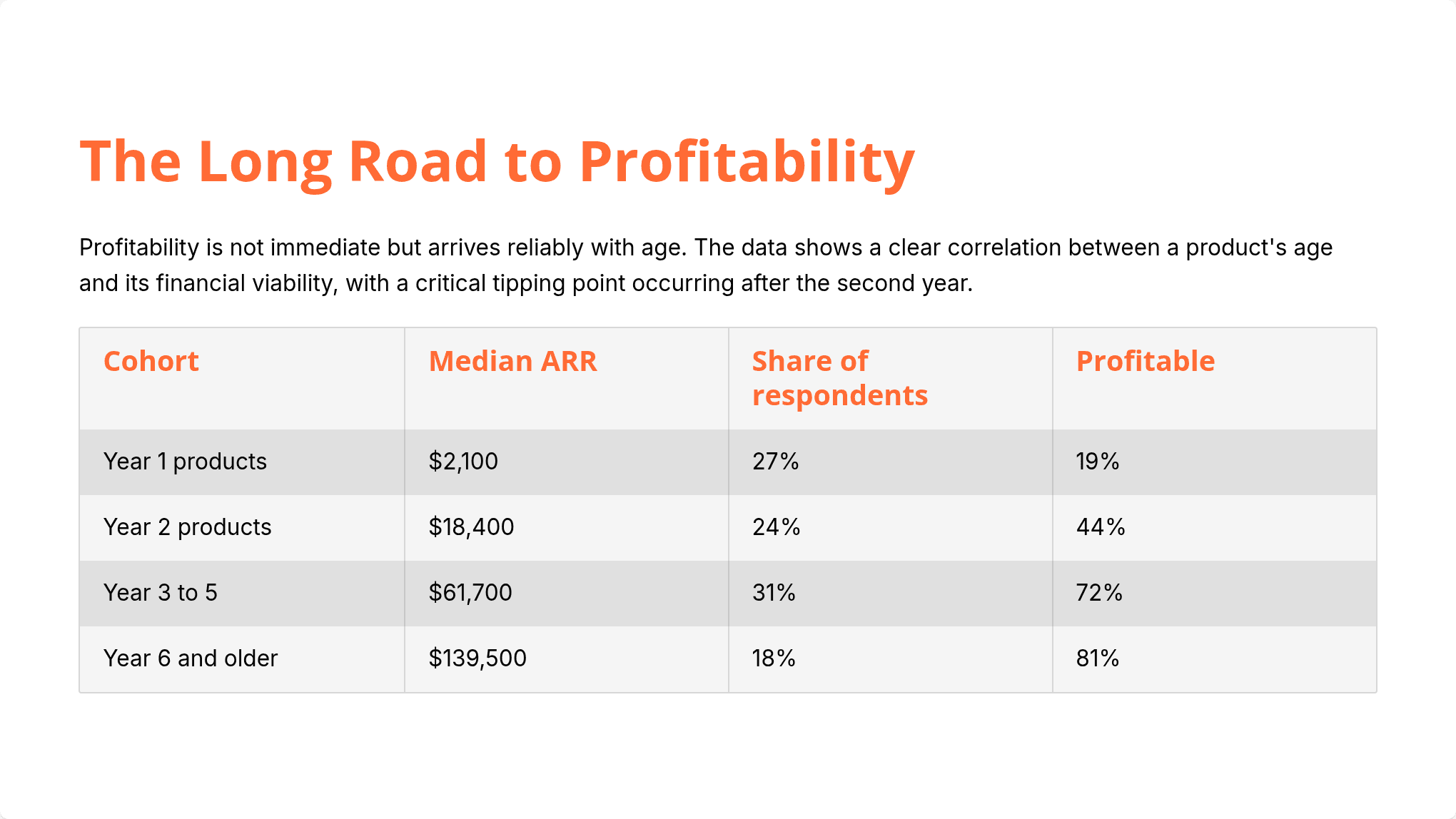
Then I started checking numbers, and I could not break it. The executive summary slide gave $47,300 median ARR, 18.4% growth, and the drop from 2.4 to 1.9 people. The distribution slide drew a pie chart reading 61%, 14%, 13% and 7%, which are precisely the four constraint figures from my table. The channel slide reproduced all fifteen cells of my five-column table, right down to the $8.40 and $11.90 costs per signup. The methodology slide gave 1,842 respondents and both exclusion counts, 214 and 97.
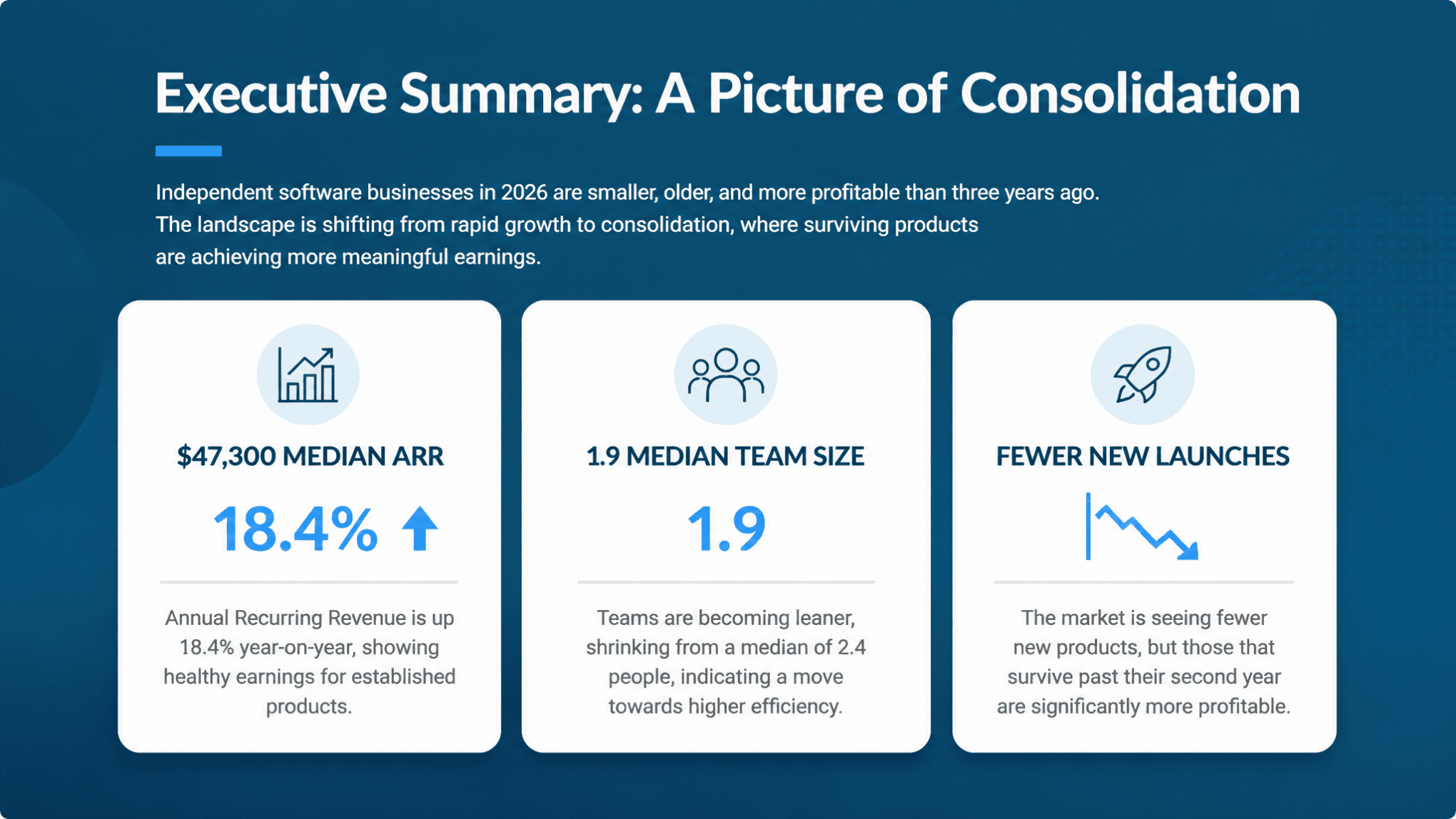
I went looking for a hallucinated number across all 17 slides and did not find one. That is not a claim I've been able to make about any other tool in this category. The cost-recovery chart on slide 6 even plotted 19, 44, 72 and 81, which are the profitability percentages from my cohort table read as a series, so it had understood the table well enough to reshape it into a different chart rather than just transcribing it.
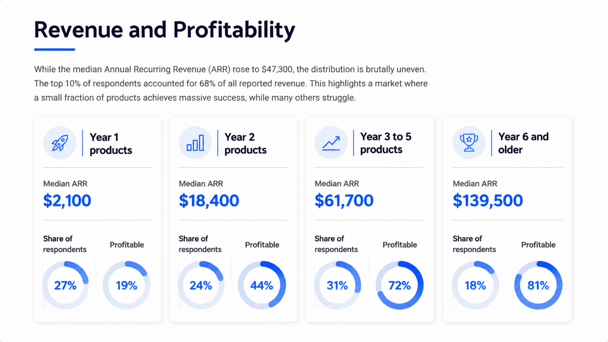
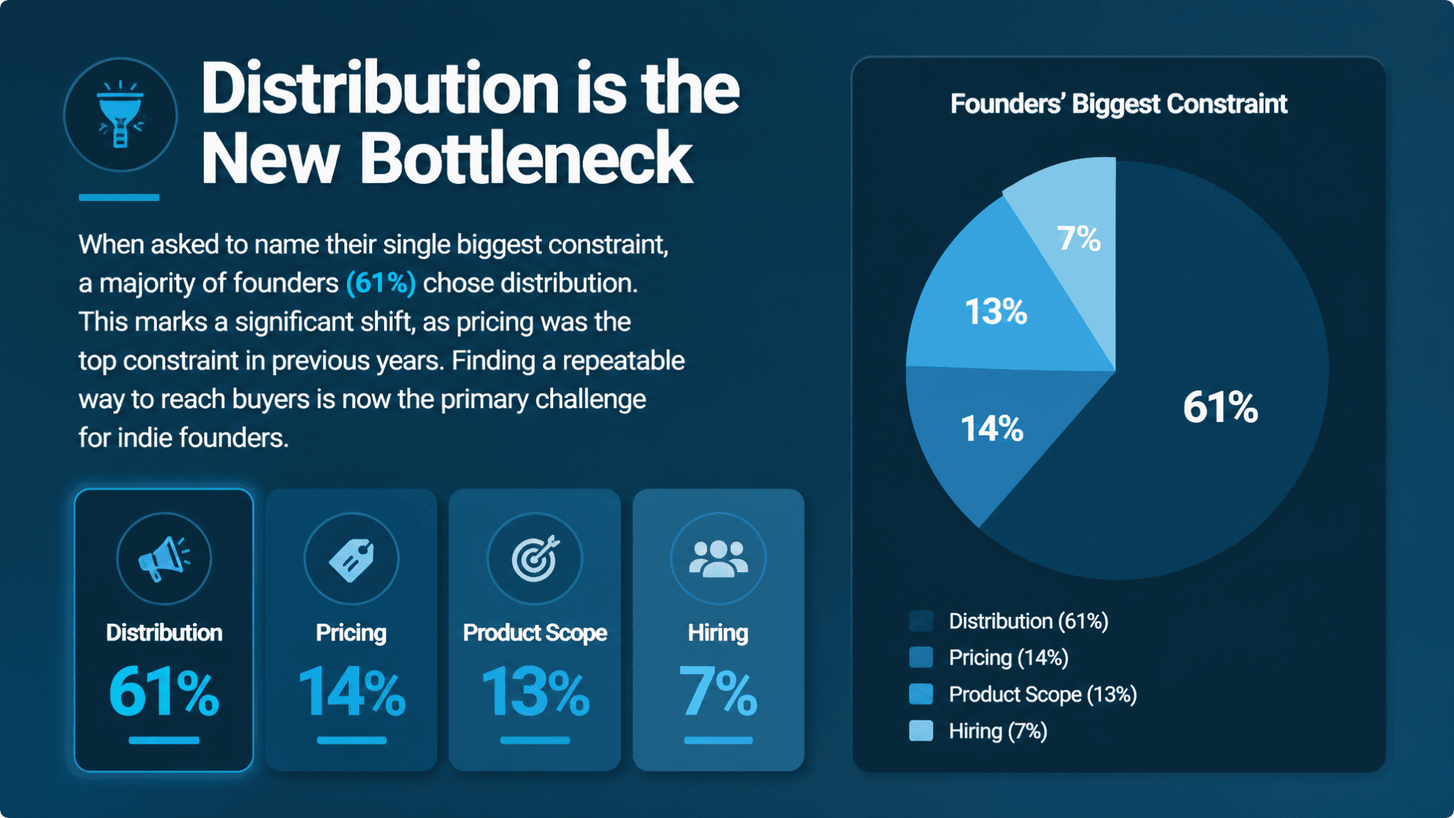
The generation itself was slow. The progress screen says "This may take 1-2 minutes"; my Beautified run took closer to twelve, because each slide's artwork is generated individually after the outline lands. Two error toasts appeared during that window ("Service temporarily unavailable" and "Request processing failed"), and one slide finished in a failed state with a Regenerate button. Clicking Regenerate fixed it in about a minute, and the recovered slide was as accurate as the rest. Sixteen out of seventeen first time is a real number, not a disaster, but you should not start a Beautified deck five minutes before a meeting.
The second target keyword here is Word to PPT, so I wrote a completely separate four-page .docx: an internal product roadmap with its own set of figures. This time I used Standard mode and wrote a specific instruction: give each of the three quarterly bets its own slide, keep every target number exactly as written, and add a closing slide listing the four success criteria.
It returned eight slides that did exactly that. Three bet slides, one per bet, in order. A closing "Q3 Success Criteria" slide with the four criteria laid out as numbered chevrons. And the numbers again survived intact: 41,800 listed products, 9,240 registered makers, 212,000 sessions with 71% organic, a 14-hour median verdict time "from 31h in Q1", the 37% decline rate and the 22% resubmission rate. It even turned the "22% to 40%" target into a two-bar chart on the bet slide.
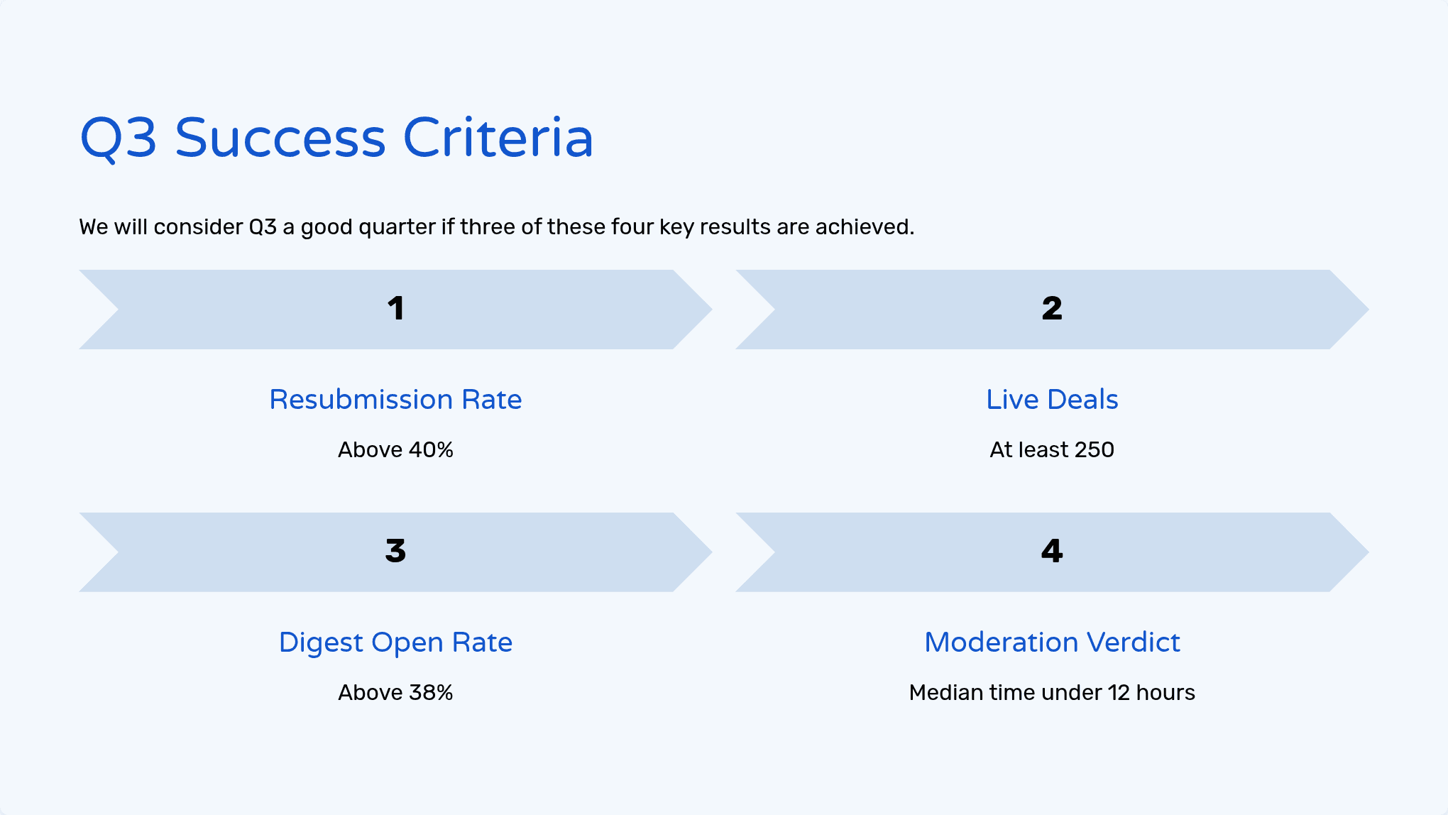
The instructions box is the highest-leverage control in the product and it's easy to miss, sitting below four dropdowns you'll fiddle with first. If you only change one thing from the defaults, change this.
Here is where I'd expect most tools in this space to fall over, so I dug in.
Inside the app, the two design modes behave very differently. A Standard slide is a normal editable object: click the headline, get a rich text toolbar with heading level, colour, bold, italic, underline, strikethrough, lists and alignment. A Beautified slide carries a small "Image slide" badge in the corner, and triple-clicking the text selects nothing at all. The app is upfront about this while it's generating, with a line under each slide reading "Note: The generated slide will be an image and can only be edited with AI." So on Beautified you can restyle a slide by asking, but you cannot fix a typo by clicking on it.
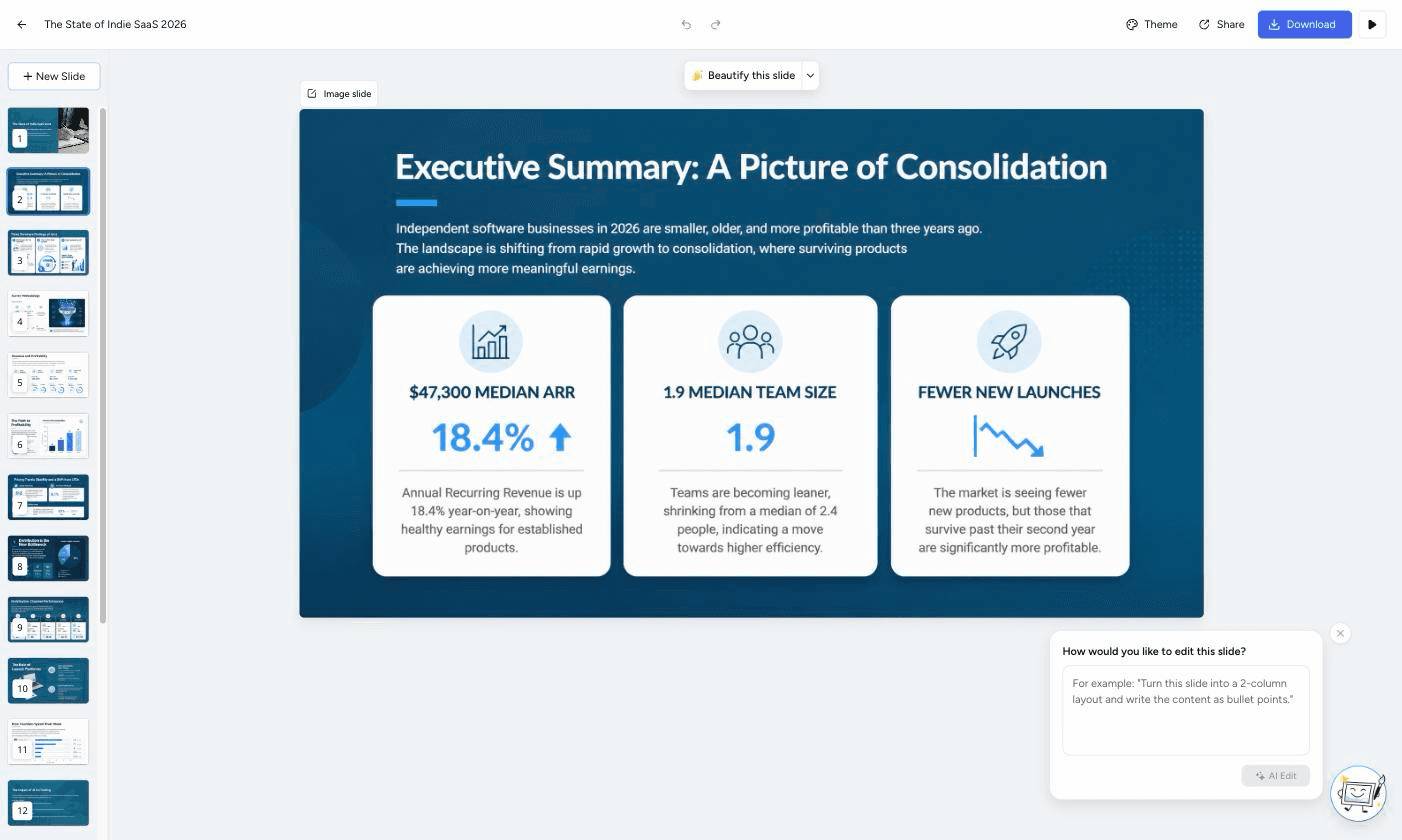
The export menu offers five formats: PDF, PowerPoint (Editable), PowerPoint (Preserve Design), Google Slides and PNG Images. Two different PowerPoint exports is an unusual choice, and it turns out to be the honest one. I downloaded all three PPTX files and opened up the XML inside them.
Preserve Design on the Beautified deck is what you'd fear: 13.1 MB, 17 slides, and from slide 2 onward each slide contains exactly one picture and zero text shapes. It is a slideshow of screenshots.
PowerPoint (Editable) on the same deck is genuinely surprising. 20.5 MB, 17 slides, 94 separate media assets, and slide 2 alone contains 16 shapes, 7 pictures and 160 text runs. The headline sits in a real text box you can click and retype in PowerPoint. The catch is that inside each box the text is chopped into word-level runs ("Executive", " ", "Summary: A", " ", "Picture of"), so retyping works but restyling a whole heading takes a select-all first. It is a reconstruction, and it shows, but it is a real one.
Standard mode exported to PowerPoint (Editable) is the cleanest of the three by a distance: 1.26 MB for 18 slides, and every text block is a single tidy run. This is the file you'd actually want to hand to a colleague.
Two caveats that only show up at the XML level. Tables look like tables in the app, but they leave as a grid of individual text boxes rather than a native PowerPoint table, so you can't add a row in PowerPoint the easy way. And charts leave as flat images; the chart folder in the file is empty. If you need a live, editable PowerPoint chart, you will be rebuilding it.
There are 26 built-in themes, filterable by Light, Dark, Education, Business, Consultant, Marketing and Academic, and a live preview updates as you hover. Behind them sits a proper theme builder: a Colors tab (theme palette, heading and body text colours, chart colours, background colour and image), a Fonts tab (family, weight, colour and a size slider, separately for headings and body), and an Images tab covering background images, accent images and AI images.
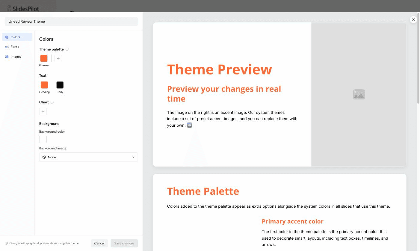
I built one in about two minutes, set a single accent colour, and generated a deck against it. The colour came through everywhere it should: headings, table header row, card fills. Small nice touch, colours you add to the palette then appear as reusable swatches in every other colour picker in the builder. One friction point: the picker panel opens on top of the swatches underneath it, so it's easy to mis-click into the saturation square and change a colour you'd already set.
The AI agent sits in a right-hand panel on every deck, with quick chips for Translate content, Simplify language and Add table of contents slide. Clicking a slide in the contents list scopes the agent to that slide, which is a smart bit of design.
I gave it a deliberately awkward instruction: add a third column to the closing slide for founders in year two, using only figures that appear in the source report. It came back with "Added a third 'For Founders in Year Two' column, using the report's 90-day public-update cadence and 3.4× shutdown-risk figure." Both of those are real figures from a completely different section of my document, which means it went back to the source rather than improvising. The column it wrote was accurate. The layout was slightly off afterwards, with two icons sitting under three columns, so it's a tool that gets the content right and occasionally needs a nudge on the composition.
A few things worth knowing that don't need their own section:
Prices are shown in US dollars. The credit costs below are published in SlidesPilot's own help centre and repeated in the app next to each image model.
| Plan | Price | What you get |
|---|---|---|
| Free | $0, no card required | A starter allowance of credits to try the product |
| Plus | Not shown publicly | The middle paid tier, documented but not priced outside the app |
| Pro | $39 / month, billed monthly | 200 AI conversions/creations, 2,500 AI credits, PowerPoint / Google Slides / PDF / PNG export, up to 200 slides per deck, custom themes, premium image models, 3-day money-back guarantee |
| Custom | Contact sales | Extra credit top-ups and enterprise or institutional terms |
Both paid tiers bill monthly or yearly, and the help centre says the yearly option saves up to 40%.
Individual actions draw on the credit pool rather than the conversion count: generating an outline costs 1 credit, adding or editing a slide with AI costs 5, editing an image slide or beautifying a slide costs 20, converting a deck to another format costs 10, and a full conversion costs 10, 50 or 200 depending on the image model you picked.
For a sense of scale: three full decks (17, 18 and 8 slides), one agent edit, one slide regeneration and three PowerPoint exports consumed 3 of my 200 conversions and 124 of my 2,500 credits. On Pro, the ceiling is not going to be your problem unless you live on Nano Banana Pro.
One genuine annoyance. There is no public pricing page. Visiting the pricing URL while logged out lands you on a sign-in screen, and the plans page inside the app only ever shows the tier you are already on. I could confirm the Pro numbers because I was on Pro, but a prospective buyer cannot compare Free, Plus and Pro before creating an account, and I could not either.
It's a strong fit if you are:
It's less of a fit if you're starting from a blank page and a vague idea. The Generate PPT tab exists, but the whole product is tuned for the case where the thinking already happened somewhere else and the slides are a translation job. It's also not the tool if you need several people editing one deck at once, since sharing stops at view-only.
The obvious comparison is Gamma, which is excellent at generating from a prompt but keeps you inside its own document format, with PowerPoint as an export you tolerate rather than a target you design for. Canva's document-to-deck flow sits in a similar place, strong on design, weaker on fidelity to a long source. Copilot in PowerPoint has the opposite trade: native by definition, but you need the Microsoft licence and it's happiest with your own tenant's files.
SlidesPilot's structural difference is that the .pptx is treated as the deliverable rather than the escape hatch, and that the content is anchored to a source document instead of a prompt. That's the axis to judge it on.
That's the end of this SlidesPilot review. I came in expecting to catch it inventing numbers, because that is what these tools do, and I couldn't. Across three decks built from two documents, every figure I checked traced back to the source, including reshaped ones like the cohort chart. That alone puts it in a small group.
The editable claim survives contact too, provided you understand the trade you're making. Standard mode gives you a clean, small, genuinely editable PPTX. Beautified mode gives you far better looking slides that are images inside the app, and a reconstructed but real text layer on the way out. Both are defensible; the product just needs you to know which one you asked for.
What I liked:
Things to keep in mind:
If your slides start life as somebody else's document and have to end life as a real .pptx, SlidesPilot is the most trustworthy thing I've tested in this category.